I'm happy to announce a new visualization for cash-flows you can find for every year in the TIME MACHINE by clicking on the year in the first column of the TIMETABLE.
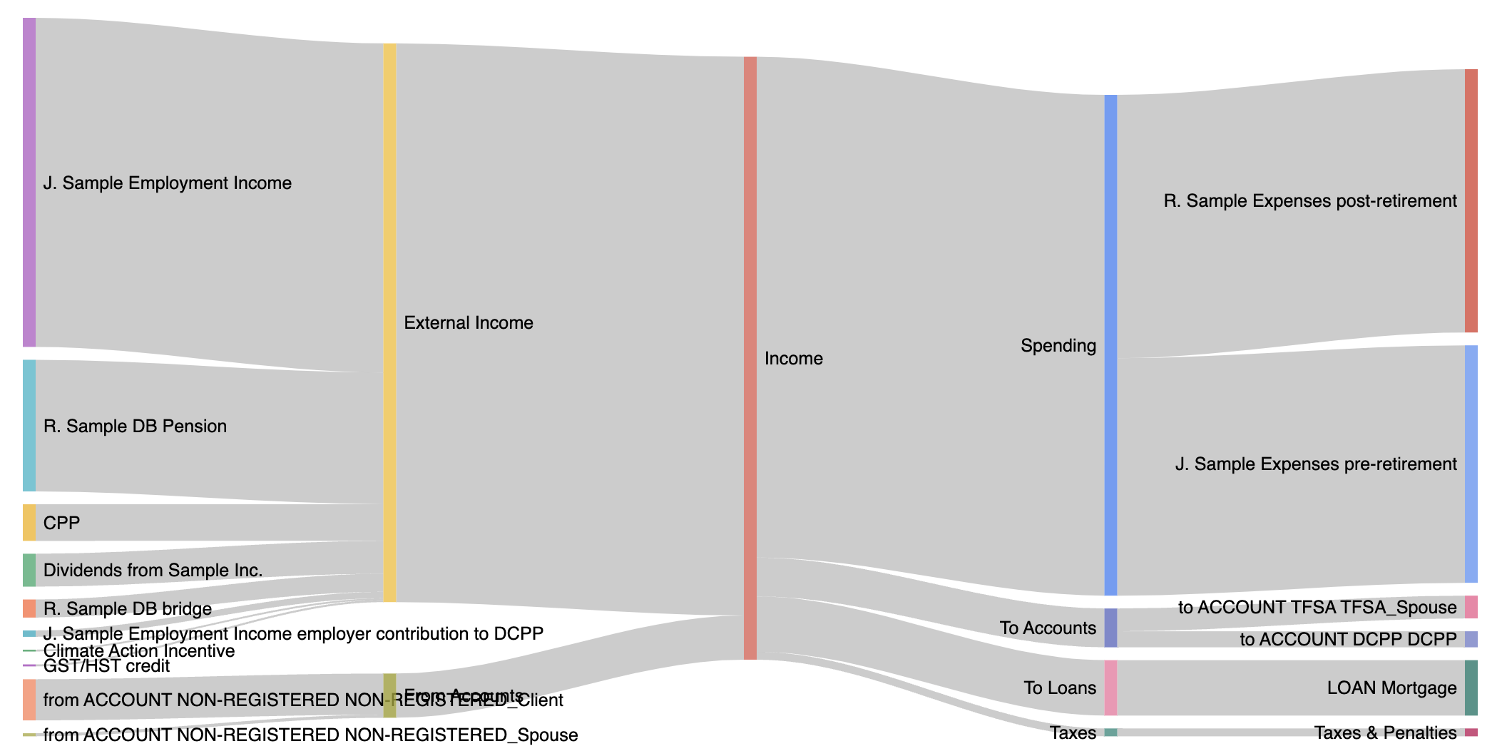
These are called Sankey Diagrams and here is an example of what that can look like:

From left to right, we first separate out Income sources as External income and Withdrawals from accounts.
From income you then get Spending, which is then broken down by your entered Expenses, grouped by type if you set up types. Then Deposits to accounts, which are broken up by account, then Loan payments and Lastly Taxes.
This makes it easy to see where the money is coming from and where it's going without looking at numbers. The numbers are still shown below as tables, and you can click also on the graph to get details (not the one shown here, it's just an image).
Because it required changes to the TIME MACHINE the feature is not entirely backwards compatible with old runs, but if it can get a plot that makes any sense, you should be able to see it even on old runs, otherwise some years may not show one. Best to get fresh runs.
You can even see 2 plots side-by-side in run comparisons.
I hope you like these new diagrams. Please let me know if you see any issues or have suggestions.